HUNTSVILLE, Ala. (WHNT) – The iconic imagery of the New York subway system earned Pentagram Design the internet’s adoration, when they launched a Kickstarter and published the New York City Transit Authority Graphics Standards Manual, bringing a deity of the design world into the home.
And after, Pentagram Design’s Jesse Reed remembers, “We had a lot of people keep on contacting us and asking us and tweeting to us, ‘You guys should do that NASA manual.'”
The manual is so iconic that it can’t just come from designers like Pentagram’s Jesse Reed and Hamish Smyth, who did go on to launch a Kickstarter to reprint it.
It comes from a moment in history.
1972 – The Apollo program that carried man to the moon, ends with a moonlit launch.
In large measure, the country shrugs, and if they wonder about NASA at all, they wonder what’s next.
1974 – A small firm answers the call to help with NASA’s branding. They come up with a new logo.
Smyth notes, “The logo came in at a time for NASA that it needed a refresh.”
1975 – The NASA Graphics Standards Manual is issued.

Smyth explains, “The book details the ‘worm logo,’ as it was nicknamed.”
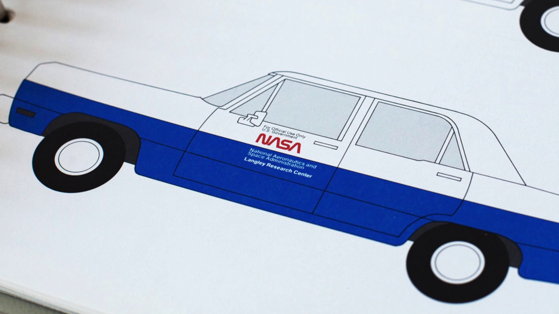
The manual details everything. Suits. Shuttles. Shapes. Shades.
And then nothing at all.
“That logo is no longer used by NASA,” Smyth explains, “It was rescinded in 1992.”
NASA returned to its old logo, known as ‘the meatball.’
“The worm was kind of wiped away,” Reed said.
But not erased from collective memory.

Smyth tells us fondly, “It has a bit of a cult following in the graphic design world.”
The manual is known for how comprehensive and ambitious it is, and in its own way, how breathtaking it is.
Smyth elaborates, “It is very iconic work, and it’s beautiful work. And the fact that it’s been rescinded has increased its notoriety, I think.”
Designers still talk about the aerodynamic curves of the “N” and the “S.” They still talk about the bold “A’s,” that without their cross stroke, resemble the nose cones of NASA’s own boldest moments.
“It just feels like a logo for a space agency,” concludes Smyth.
Comprehensive, ambitious, breathtaking.
And now, it’s for sale in the form of a coffee table book.
Reed does say, “This campaign, it’s similar to the subway book, where we’re only selling it for the length of the campaign. So after the campaign closes, it’s not going to be in stores or for sale after that.”
They’ve got all their funding through Kickstarter.
They just need to know how many copies to print.
And if you want one.
The books are only available through the length of the campaign, which has about a month left. They’re $80 per copy.
Here’s the Kickstarter link.


